Thursday, September 15, 2016

Artistic Influences

Today, I'm going to write about artistic influences, which to me is one of the most important aspects of an artist's development. I've long admired the works of the Old Masters, especially Peter Paul Rubens, Van Dyck, Thomas Lawrence, Henry Raeburn and the more contemporary painters, Sargent, Sorolla, and Munnings. There are countless other painters I admire, but these artists represent the core of my artistic influences. I also want to emphasize once again, the role of the subconscious. We may or may not be aware of what inspires us to paint what we do.
As I've stated in earlier posts, I studied portraiture at the Art Students League with John Howard Sanden. Sanden is a slick, brilliant painter, with soft colors and attractive people in his canvases. I could have studied with one of the more classically trained artists at the League, but I liked the fresh quality of Sanden's portraits, and his excellent draftsmanship. I had just come from Aviano's atelier, where students were required to paint the same thing for weeks at a time, so I was ready for something different.
I learned a great deal from working in Sanden's class. Sometimes I'd paint the same pose for the entire week, sometimes I'd pick a different view each day. Sanden's lectures were lively and informative and I never needed to take notes. I remembered most of what he said, even to this day. He was lavish in his praise for his students' work, and was one of the biggest influences of my life. Although I didn't end up painting portraits of people, the training I got from his class was invaluable.
About ten years ago I attended one of his lectures at the Salmagundi Club in New York City. He was giving another of his memorable performances, telling of his world travels and famous people he's painted over the years. When he stated that he never copied other painters or paintings, I thought perhaps I misunderstood him, but when someone in the audience asked him about other artists' influence, he reiterated that he's never been influenced by anyone else's work or ideas. I find that quite remarkable. Why would any artist want to eliminate a source of inspiration, no matter where it comes from?
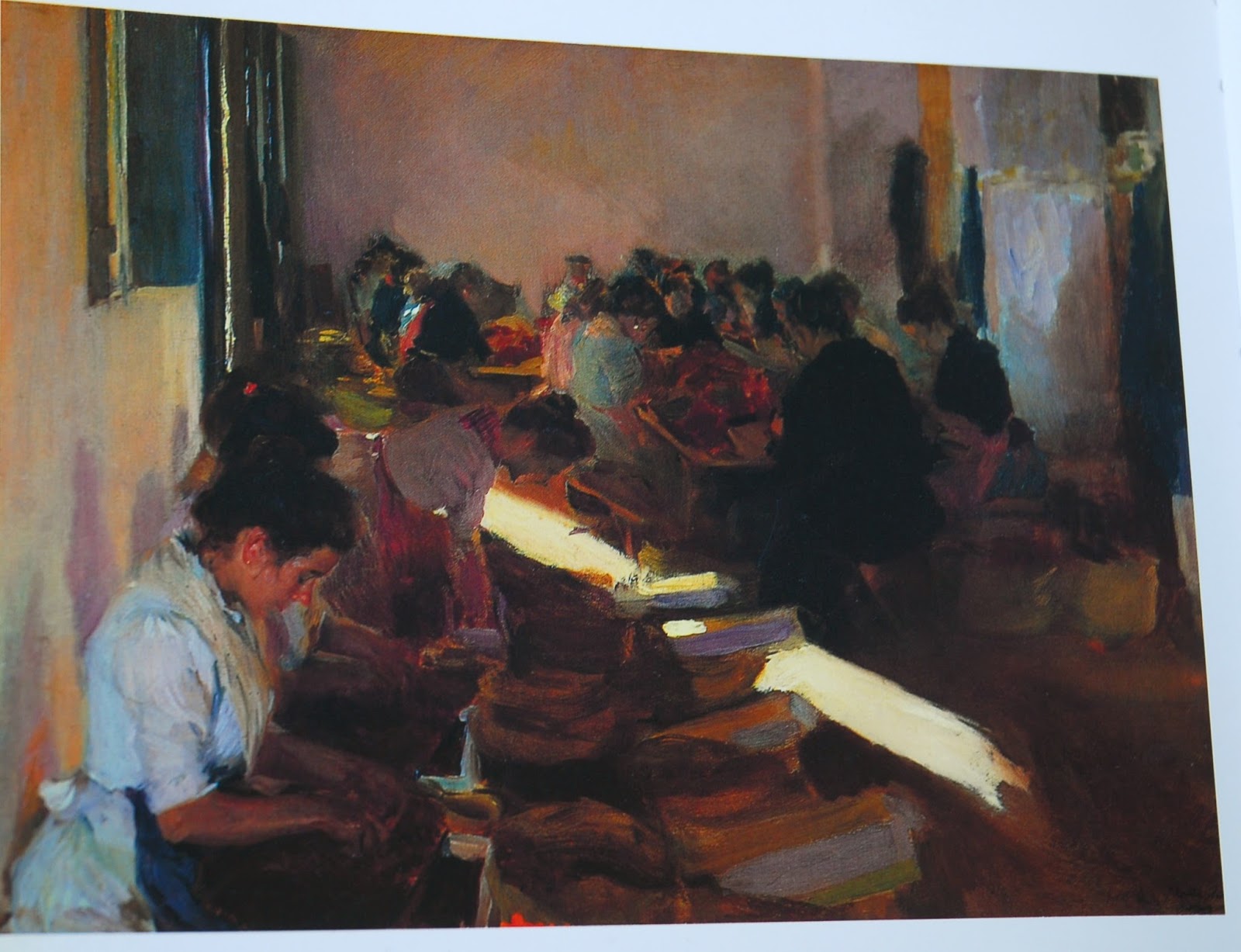
For example, I went to see the Joachim Sorolla exhibit at the IBM Gallery of Science and Art on 57th & Madison in 1989. It was a very large exhibition, with many paintings never before seen in this country. We all know about his gigantic murals up at the New York Hispanic Society in the Bronx, but this was a show of his astonishing pictures of children on the beach, women in cool interiors, and the unforgettable "Mending the Sail," a magnificent, life-size study of sunlight and shadow.
"Sewing the Sail" by Joaquin Sorolla
Back in the 1990's, when Thomas Hoving was turning every exhibit at the Metropolitan Museum of Art into a mega-media event, with lots of hype and PR, here was an important exhibition that was flying below the radar. People were overheard asking, "Why haven't we ever heard of this painter before?" Several of the paintings made a deep impression on me. Of course "Mending the Sail" was a marvelous tour de force, but another, smaller and unpretentious painting titled "Picking Raisins" also caught my attention. It shows a dark interior with women performing some unknown task. A broad diagonal slash of yellow light cuts across the plane of the floor, neatly slicing the picture in two. A very thin sliver of light indicates the door, the only clue as to the light source.
Years later, when I was visiting friends in Kentucky I was taken to the Kentucky Training Center, where horses were being walked along the shed row. A thin stream of sunlight was shining on the floor, coming from an open door. As the horses walked through the light. I was mesmerized by the effect. It immediately brought to mind the painting by Sorolla. Of course, when I got home I worked up a canvas of the subject. It's still one of my favorite paintings, although now I'd like to make the edge of the light less square at the end, a la Sorolla.
"Morning Sunlight"
Sometimes we're aware of these influences and sometimes we're not. I recently made a discovery about Munnings and Charles Wellington Furse, one of my favorite unknown horse painters. He was an extremely precocious painter, painting some of the most beautiful pictures I've ever seen (alas, only in books). He was in poor health his entire life and died at the age of 36. I can only imagine what he would have accomplished had he lived as long as his contemporaries, Munnings and Sargent. "Cubbing With The York and Ainsty," a life-size painting of the children of the M.F.H., Lycett Green, Esq., was painted in 1904, the year he died. A large group of children on horseback sweep in from the left, two boys and two girls and a few stray hounds at their horses' feet, with the huntsman and his hounds off to the right. It's a masterpiece of atmosphere and light, even more remarkable considering much of it was done in his studio. Even the size of the canvas, 7 feet x 9 1/2 feet, belies the effort it must have taken, given the extreme frailty of the painter. In 1908, four years after his death, the Burlington Fine Arts Club published the "Illustrated Memoir of Charles Wellington Furse, A.R.A." It's a lavishly illustrated, over-sized catalogue of an exhibition of his work held posthumously at the Club in 1906.  Along with thirty-five black and white reproductions of his paintings are Furse's lectures and letters, including one where he describes working on the picture to his wife. "The picture moves. and the children are almost finished, and to-day I get a bay horse into the room, and hope to get ahead with that. It is exciting as he will have to mount half a dozen steps, and I am a little alarmed lest he put an erring hind leg through the canvas. I am staying on (in London, I'm assuming) to finish as far as may be - the hounds and the bay horse and the head of the little girl's horse, part of which shows." The picture was exhibited at the Royal Academy the year after his death, (as far as I can ascertain), since the catalogue states the painting was exhibited at the R.A. before being shown at the Burlington Club in 1906.


There was another young whipper-snapper exhibiting at the Academy in those days - Alfred J. Munnings. Now you can't tell me he didn't see Furse's painting. It's a gigantic masterpiece, one not easily missed or overlooked. One can just imagine the impression seeing it must have made on the young Munnings. He was exhibiting two pictures that year, "Leaving the Fair," and "The Low Meadows." He was only twenty-seven at the time and quite impressionable. His influences were still tied to the German painters of the late 1800's, as Brian Sewell notes in his article in the Evening Standard, "These (paintings of gypsies and horse fairs) were a response to the lively, even urgent, compositions and fluid brushwork of Heinrich von Zügel, a now forgotten animal painter long established in Munich, where Munnings was again in 1909; it should not be forgotten that Munich was then still one of the great European schools of painting, particularly of academic realism."
http://www.standard.co.uk/goingout/exhibitions/sir-alfred-munnings-an-artists-life-richard-green-w1-8319257.html
Fast forward twenty years to 1924, when Munnings was in great demand as a portrait painter. He was asked to paint a large group portrait of Lord & Lady Mildmay of Fleet and their two children on horseback. The painting has remarkable similarities to the Furse painting. I discovered this likeness while perusing Christie's sporting art catalogues in my library. There on the cover of the December 1999 sale is a detail of the Mildmay painting. Because of the way it's cropped on the cover, its striking similarity to Furse's "Cubbing With the York & Ainsty" is clear. The turn of the girl's head, the positioning of the riders and their mounts, even the horse with his head lowered, have their origins in the Furse painting. Now, I'm not saying Munnings deliberately copied the composition, but I am suggesting that the influence of Furse's picture is clearly evident. I think Furse's painting has more movement and is exciting to look at, while Munnings' portrait has a stiffness I associate with commissions in general. We never seen to be able to paint the picture we'd like to paint, but rather have to defer to some degree to the wishes of the client.


The degree to which we're influenced doesn't necessarily depend on whether we choose to be influenced or not. At times we make a deliberate choice to use something in our work, but there are often times when we're unaware of the source. Earlier in this post I stated that Furse was an "extremely precocious painter." Imagine my surprise when, checking some of the information, I came across this description of him in the introduction to the catalogue, "precocious artist." I know I must have read this intro before, proving my point!
All the information for this post has come from books in my own collection. It's quite a luxury to be able to research what paintings Munnings was exhibiting at the Royal Academy in 1905. Thanks to Jean Goodman's, "What A Go! The Life of Alfred Munnings," I was able to find the complete list of paintings he exhibited at the Royal Academy, starting in 1899 and ending sixty-one years later. After I finish writing this, I'm going to go back and count how many paintings Munnings exhibited at the Academy. It's rather impressive!
Books are a great resource for me and one of my greatest pleasures is to peruse volumes long out of print. I urge everyone to maintain as large a library as possible. There is so much information to be found in books. Of course, the Internet is a great resource too, but there's nothing like a thumbing through the pages of a good book to find just the information you're looking for.
I'd love to hear what influences you. Please write a comment below.
Reading List:
"Illustrated Memoir of Charles Wellington Furse," Burlington Arts Club, 1908
"The Painter Joaquin Sorolla y Bastida" by Edmund Peel, 1989
"What A Go! The Life of Alfred Munnings" by Jean Goodman, 1988
Christie's New York, Sporting Art Sale Catalogue, Wednesday, 1 December 1999

Friday, September 9, 2016

Should You Discount Your Work?


I'm back from my summer in Saratoga Springs, NY, after spending a week in Colorado with our son, who's out there studying mechanical engineering. Colorado is breathtakingly beautiful. I'd love to spend some time out there painting the mountains and skies. The lack of oxygen at that altitude though is alarming. I'm in decent physical shape, but hiking up the mountains was difficult because I couldn't breathe. It's a little frightening at first, but in moderation, you can acclimate yourself to go a little farther each day. Someone told me taking aspirin also helps because it thins your blood. Hopefully I'll be able to spend more time out there in the future, and make it all the way to the top of Horsetooth. It's a funny looking rock, and is the iconic landmark associated with the college town of Fort Collins. I love the name. Sort of like when I had a doctor named Dr. Withers. Hee haw!
The thing that really struck me on this visit was the lack of overweight people living in Fort Collins. Everyone seems to be on a health kick out there - even pregnant women were climbing up the mountain like goats! Lots of health food stores, restaurants and juice bars. Cars equipped with bike racks, kayaks, fishing and camping gear, tons of half ton pickups, RVs and campers going up or down the mountains to get to that favored camping/fishing spot for Labor Day. Bikers were everywhere, cycling up impossibly steep roads, undaunted by the summer heat or slope of the mountains. They take their fitness very seriously out there. I go to the gym three times a week and walk a lot, but those people take it to a whole other level. Pun intended.
The instant I set foot on the ground back in New York (Newark, actually) I was shocked to see how many people still smoke on the East Coast! I went outside the terminal to look for the shuttle and the smoke was so thick it smelled like the inside of a bar! EVERYBODY was puffing away on cigarettes, e-cigs and cigars. Nobody in Colorado smokes - at least not tobacco anyway! I couldn't help but notice all the smoke because I'd been in that clear mountain air for a week. Although I don't take my personal fitness to quite the same level as Coloradoans do, I think people would be a lot healthier on the East Coast if they just gave up their ciggies.
But let me get back to the Saratoga saga and my success, or lack thereof, with the gallery. I'd say all in all, it was a successful venture, but I'm not sure I'll be doing it again next year. The amount of work involved is staggering. I'm getting too old to do this myself or even with the help of my husband. Hiring people to set up the gallery is expensive and a bit frustrating. I had to design the layout of the gallery on the fly because the walls were so heavy that once you put two of them together there was no moving them. I actually had to figure out how a thousand square feet of space would flow from a small piece of scrap paper with X's and squares on it. Once the walls were set up (with the help of two hired hands), it was a simple matter of deciding where every painting would hang and every sculpture would go. Only kidding! It's never a simple matter; it requires a lot of thought and planning. It takes a few days to hang even a small show like mine. Then we had to hang the lights to properly light the paintings. I installed some extra fixtures myself after the gallery was set up, because it was essential that people could see the paintings properly. The space was always evolving too. A friend gave me some extra print racks, so I had to improvise a way of displaying them so people could browse through them all. Finally, I had to print and cut out labels, order posters, and hang up my shingle announcing I was open for business.
Traffic was spotty at best. People staying at the hotel seemed to be in a hurry - checking in or out, going to or from the track, going to the pool or parking garage, going out to dinner, or coming back from dinner too inebriated to look at paintings. I used to hear stories about a certain gallery owner who loved that sort of client - especially in the wee hours of the morning!


I advertised in the only paper worth reading up there - The Saratoga Special. The Clancy brothers - Joe and Sean - started it 16 years ago and have turned it into a very successful publication. They're terrific writers - smart, funny and they really know their horses. They were jockeys before they became writers. I got most of my visitors to the gallery from the advertising I did in The Special. I was very impressed with the response I got from my 1/4 page ads.
I came away with several commissions, some sales and some contacts. I don't know if that will translate into enough sales next year to make it worthwhile. The old adage, "You have to spend money to make money" is true, but spending money doesn't always guarantee that outcome, and one has to be savvy enough to know when and where to draw the line, so to speak. I think the perception people have of the galleries in Saratoga has changed. They don't seem to understand the long tradition it represents. An art exhibit is no longer a destination; it's just a diversion on the way to something else - dinner, drinks, the track. People would walk through the gallery like they were going to catch a train - hardly bothering to stop to read a label or look closely at a painting. I'd hear people out in the hallway, commenting on the beautiful paintings inside, but they rarely took the time to come in and take a better look. I just couldn't understand it.
So let's tackle the question posed in the title of this post - Should you discount your work? The answer is a complex one with no "one size fits all" solution. I'm sure you've all had the experience of putting your work in a gallery and painstakingly writing out a consignment list of the work, title, size and price, and the commission taken by the gallery. When you get your first check from the sale of one of your paintings however, you're surprised to find that the price was reduced by 15% before the gallery commission was taken out. When you ask the dealer what happened, he tells you a client bought four paintings, one of which was yours, and was given the usual 15% discount for buying in quantity. Or just that the client asked for a better price and the dealer gave it to him to "help the sale."


The day before I closed the gallery, I got a call from a prospective client about a painting he was very interested in. I was a bit surprised to hear from him. A week earlier he and his wife had come in and seen a painting they really liked. They were effusive about it. They discussed where it would go (their home or his office), how they could fit it in their car, etc., and said they'd be back the next day to pick it up. They didn't come back and I put it out of my mind. It happens a lot in this business. "I'll be back" or "I'll be in touch" is a phrase which often means just the opposite. This prospective client was now back home on Long Island and wanted to know if the painting was still available. I told him it was and we discussed the price again. I had given him a very good discount when he asked if that was my best price in the gallery. I wanted (and needed) to make a big sale. It's a very large painting and it was priced at $9,000. I offered him a 15% discount, thinking this would seal the deal. But they walked out without the painting and didn't show up the next day. It was now even more tempting to accept his cash offer over the phone. Here was my chance to make the sale. But at what cost? Essentially he was asking for a 44% discount! I told him very politely that perhaps we could discuss it in the future when he could meet my best price of $7,500. I thought that was a good way to phrase it. I hope he does call again, to tell me he has the money to buy it. It would put me in the black. But if he doesn't, that's okay too. There's a difference between negotiating a deal and giving away your work. "Suppose it never sells?" you ask yourself, as you weigh your options. That's a chance you'll have to take. It's been my experience that serious collector's who have limited funds will often ask to work out a payment plan on a work they want, rather than pass it up. Some artists don't want to negotiate at all, which I used to think was a bit unreasonable. People like to haggle. Especially in this economy. Price your work accordingly and then add 15%, so you can give a discount if requested. They do it all the time in business. Why can't artists be savvy business people too?
The bottom line is, I didn't sell the painting, even after I gave the client a very substantial discount. What does that tell me? It tells me he doesn't want the painting badly enough. I have no way of knowing whether he can afford it or not. Perhaps there are other things he'd rather spend his money on. Or he likes playing the game. Haggling is a game I'm not terribly good at playing. Perhaps I just don't know how to close the deal.
What I came to realize is that my work has a value, and selling it for way less than what I think it's worth would make me feel worse than not selling it at all. Even when the bills are piling up. An idealist? Maybe.
Jonathan Shepard, one of the most successful trainers ever to saddle a horse, came in while I was on the phone with my client. He'd overheard my conversation and when I got off the phone, he asked me if that was somebody trying to "beat me down" on my price. When I replied yes, indeed it was, he gave me some solid advice. "Stay firm!" he declared in his impeccable English accent. By Jove, I think I will!

Friday, August 26, 2016

The Demise of the Art Supply Store

I had an interesting visitor in the gallery today - a sales rep who sells frames and artists' materials to stores nationwide. We had a long talk reminiscing about the good old days when art supply stores were plentiful and stocked with real artists' supplies.
When I first began painting (back in the Stone Age), New York City seemed to have art supply stores everywhere you looked, and they were fully stocked with materials for every type of art - fine, commercial and graphic. Arthur Brown, Pearl Paint, Sam Flax and Freidman's had at least one location in the city, but typically many more. It seemed there was a Sam Flax on every corner. These stores were geared more towards commercial art. This was because all the advertising agencies and publishers needed stores close enough to be able to deliver art supplies in a timely manner - sometimes the same day. Archaic items like rubber cement, layout pads, pencils, colored markers and storyboards, which have become obsolete in the age of computers, were all standard fare back then. If an office ran out of something it wasn't a problem because you just went down to the local branch on your lunch hour and charged it to your corporate account. There were specialty stores too, like Joseph Torch, on 14th Street and Eighth Avenue where you could look through shelves loaded with fabulous handmade papers - sumptuous watercolor and pastel papers from France and Italy, drawing pads and watercolor blocks of Fabriano and D'Arches. All of this was standard fare - no special order was required. Imagine that if you can!
For everything else, there was Arthur Brown in midtown. A large, fully stocked art supply store, it was the place to go for the finest quality sable watercolor brushes, oil paints, pens, printing inks and sculpting materials. The prices were a bit steep, but if you needed something that wasn't quite mainstream, this was the place to go. I don't remember when Pearl Paints actually showed up on my radar. I seem to remember they sold house paint or something, and it wasn't the giant art supply warehouse it later became.
When they closed its doors on Canal Street a few years ago, it sounded the death knell for quality art supply stores everywhere. Even though I live within commuting distance of New York City, there is no longer a retail store devoted exclusively to art supplies. With all the mergers and closings, such as Utrecth and Dick Blick, these stores have become mega stores that substitute vast quantities of pseudo-art supplies for quality artists materials. They cater to no one. One size fits all. The only drawing paper you can find is Canson pastel paper in a limited number of colors, and even if you find a suitable color, the sheet will invariably have a dent or crease in it from someone carelessly putting it back into the poorly designed wire display shelf.
I detest the craft stores that have monopolized the market. A. C. Moore (which I consider to be the best of the lot, although by no means a suitable substitute), Michael's and the new kid on the strip mall block, Hobby Lobby, seem to have thousands of items I will never use, and nothing I actually need. There isn't a store in existence in New Jersey where I can just walk in and buy something as simple as a Robert Simmons Filbert bristle brush.
Try getting a roll of primed or unprimed linen canvas, or a bottle of turpentine, let alone a particular kind of brush. Or a stretcher that isn't an even size. It's not that the store is temporarily out of stock; they don't carry odd sized stretchers because there's not enough of a demand for them. A 15" stretcher requires a frame with a 15" measurement somewhere in its configuration, which doesn't exist in their tidy little world of standard sizes. And yet, you'll find row after row of mirrors, candles, furniture, millions of different markers, beads, popsicle sticks, rubber stamps and ready made frames. Heaven help you if you need a frame other than a 8" x 10", 11" x 14" or 16" x 20". At one time you could purchase wood or metal frame sections in any size and assemble it at home. Although they were all very basic, they served in a pinch. Not anymore. They're long gone. Your only option is to order a custom frame. All custom frame orders in these places are horribly overpriced (even after the automatic 50% discount they give on every order), the people aren't very knowledgeable, and it takes many weeks to make just one frame. This is not the type of service any serious artist can or should tolerate. Maybe it's fine if you're framing a print to go over the sofa, but an artist doing an exhibition with upwards of a dozen paintings to frame in a hurry? Never.

When I lived in New York City, things were simple and uncomplicated. When I moved out to the suburbs, I became aware of how limited the access was just by virtue of the fact that I was "no longer in Kansas anymore, Toto," but the problem was still manageable. Whenever I couldn't make it to Pearl Paints on Canal Street, I'd drive to the one in Woodbridge, NJ. Not the same company, or so they insisted, but they had the same name, same logo and most, if not all, the same inventory. It was a good alternative to driving into the city. When they closed, I discovered the Utrecht Outlet in Cranbury, NJ. They had a fabulous warehouse sale once a year, where they pretty much gave the stuff away. I bought things like sculpting, woodcutting and etching tools, with the idea of using them someday. (I haven't used any of them to date!) But the deals were so fantastic, I couldn't pass them up. One year I came away with two gigantic rolls of primed Belgium linen canvas, and a carton of four  48" x 60" gallery wrapped canvases for less than the cost of one roll of linen.
It's not the bargains I miss so much as the assortment and variety of the materials available. What do art students, amateurs and even professionals do nowadays? I'm constantly amazed by the lack of knowledge of the sales clerks in these stores, and the tacit acceptance of these stores by the people who frequent them as the go-to place to buy their art supplies. I'm often asked about materials when I'm shopping. My advice is invariably more helpful than the employees'. After all, most have never used any of the supplies they sell. What a difference this is compared to the employees at Pearl Paints, where the employees were sometimes more knowledgeable than college professors about the materials they were selling.
Art has always been on shaky footing when it comes to choosing a career. How many of you were told by your parents, "That's fine dear, but how are you going to make a living?" Or asked, "When are you going to get a real job?" Fortunately, I never got that from my parents. I was encouraged to pursue the career I seemed to want even as a young child.
I was informed by the visitor in the gallery that the last bastion of this old world order, New York Central Supply, down on the lower East Side is also closing its doors forever. What a shame!
So the odds are definitely stacked against young artists these days, as it becomes harder and harder to obtain the basic materials needed to paint and draw. There are many teachers and schools that still teach classical methods, such as Juliette Aristides in Seattle, Washington. She has written two excellent books, "Classical Drawing Atelier" and "Classical Painting Atelier". One must be very determined to become a classically trained fine artist these days. The rewards of an artist's life, however, are definitely worth the effort.

Tuesday, August 23, 2016

New Heights!

Yesterday I got 45 page views! Thanks everybody! Keep coming back.
Being in the gallery all day has given me the opportunity to really study the paintings of the artists I represent - Heather St. Clair Davis, Peter Smith, Booth Malone and Larry Wheeler. I've discovered a few interesting things lately. For instance, the Heather St, Clair Davis landscape has a fox in the foreground that's camouflaged by the rust and brown colors in the brush. I made an even more exciting discovery this week. She signed the painting twice! While studying the way she painted the grassy lane that takes your eye right into the middle of the painting, I noticed some underpainting below her signature that called for a closer examination. Under the surface, there it was - her signature in a light, Naples Yellow hue. It's bigger and lower than the second signature, which is in brown. It's been painted over, but is still faintly visible. Now you might ask yourself why she did this. Someone even asked me if this meant it was a fake. Rest assured; it doesn't mean it's a fake. This is an exciting discovery that only adds to the value of the painting.
Two signatures are visible - one in brown, the other in faint yellow.
For centuries artists have repainted, resized and revised their work. When it's visible, it's called "pentimento." The brush strokes and sometimes even the color, come through the top layer of oil paint, making it visible to the viewer. The significance of pentimenti (plural) is that they offer a unique glimpse into the painting process of the artist. (Wikipedia has a pretty good definition of the term if you don't have access to any books on artists' methods and materials such as Mayer, etc.) John Singer Sargent often repainted areas of his large canvases of aristocratic clients in elegant gowns and luxurious surroundings. The most famous of these is the fallen strap on Madame Gautreau's gown in Portrait of Madame X. It caused quite a stir back then - it symbolized scandal and loose morals! Although Sargent exhibited it at the Salon in Paris in 1884, it was not well-received and the sitter's mother asked that it be withdrawn from the exhibition for fear it would ruin her daughter's reputation. Sargent refused, but later repainted the strap so that it was sitting on her shoulder. It's now in the Metropolitan Museum of Art and is considered one of Sargent's finest paintings. (Personally, I've never cared for it. The contrived pose with her twisted arm, the minimalist background and sickly complexion of the sitter have always made me uncomfortable. Madame Gautreau was considered a beauty in her day, but this painting hardly flatters her. Parisians must have felt the same way, for it was soundly rejected by the public and the critics, and quashed Sargent's hopes of establishing himself as a portrait painter in France.)
I suspect Heather might have restretched the canvas or changed the size, because the first signature is very close to the edge of the frame. I'm not an expert; I only know from my own painting adventures that a composition can be improved by changing the size. (There's something to be said for doing preliminary sketches. Ahem!) The painting has backing paper on it, and I'm not going to open it up to see if that's the case. A prospective buyer, on the other hand, might actually request it to learn more about the painting.
I have a pair of paintings I did of a fox cub or kit and English foxhound puppy in the gallery. Originally they were 8" x 10". I put them in square 8" x  8" frames which I had lying around in the studio. It only occurred to me to cut down the pictures after trying to find some finished paintings that would fit the frames! They look so much better in the square format and yet, it would never have occurred to me to change the size if I hadn't been scrambling to find finished pictures for this exhibit!
Oopps! Unsigned. Better get the paint and brush out!

Monday, August 22, 2016

Travers Week!

Travers Week. When the racing world converges in this small upstate town in anticipation of the summer's final showdown. This is what's known as the "top of the stretch". The homestretch, the final strides to the wire, the finish line! Travers Week is traditionally the week leading up to the most important race of the entire meet. Saratoga is called the "Graveyard of Champions" because so many champions have been beaten here. The Travers is notorious for the favorites getting beaten. Secretariat, Affirmed, American Pharoah all suffered the same fate - a loss in the Travers. Losing to horses who just seem to come out of the woodwork for this one race and then retreat right back into it.
Last Saturday's Alabama was the unofficial start of Travers Week. We were treated to a spectacular win in that race by America's newest sweetheart, Songbird. A filly who looks like her daddy (in horse racing that's a good thing; in people, maybe not so much) and runs like him too. Only faster.
My parking space karma was good, as usual. I left the gallery around 4:30 pm and drove straight down East Avenue to the front door of the track. I did a quick K-turn to snag a spot half a block from Union Avenue, facing in the right direction (away from the track). I got to the paddock in time to see the eight race on the monitors before figuring out my "spot" - the best place to try and get a photo of Songbird. (I took my camera this time.) I looked in my program to see what her post position was, and looked around for tree number 6. No karma here. The "6" was across the paddock, near the saddling enclosure, as far away as it could possibly be. I'd only have two chances to photograph her up close before the race - coming into the paddock and going out. The trend in the past ten years has been to have two grooms accompany the horses in the paddock, so getting a photograph of the horse's head and neck without a person blocking it is now impossible. Undaunted, I pick a spot along the rail near Big Red Spring. It's a shady spot, with long shadows and large patches of sunlight. The  horses for the Fourstardave are now beginning to enter the paddock. King Kreesa and Grand Arch (last year's winner) are being saddled under the trees directly in front of me. I click away. Great light. Great color. I can easily picture what I'm going to paint here.
King Kreesa and Grand Arch (#2)
Then it's, "Riders up!" The horses leave the paddock but I stay put. I don't want to loose my spot. The race goes off and there's an inquiry after the race. It delays the start of the Alabama a few minutes.

"KEEP BACK 4 FEET" is painted in big red letters on all the paddock rails. Used to be a time when there weren't any rails surrounding the paddock. People could just walk among the horses being saddled to get a better look. I know, I know. The world is a different place now. But I think it sends the wrong message to the fans. It certainly isn't a very friendly message. Everybody just ignores the warning.
Entering the paddock
The horses are entering the paddock for the Alabama now. They come into the paddock in consecutive order, one, two, three. I look for number six. Here she comes. Her head's down and there's lots of tack on her - bridle, halter, etc. It's hard to see her face. They walk directly to the saddling shed. They don't take a turn around the tree or anything. I'll only get one more chance for a photo when she comes out. They no longer walk the horses around the paddock one full time. Just put the riders up and walk out to the track. Songbird has a lead pony in the paddock, which further hides her from view.
Songbird!
The pony is in the way as she comes around the corner.
The lead pony blocks my view!
I get wonderful shots of the pony....
It took me three weeks to notice that the saddlecloths are color coded - red and white for number 1, white and black for number 2, etc. It's always the same for every race. I feel rather silly, since I'm supposed to be so observant! They have the name of the race and the horses on them for the Alabama.
I race down to the end of the grandstand to get some photos of the horses warming  up. I finally have a chance to get some full length photos as they warm up. I take some nice shots of Weep No More, Going For Broke, Go Maggie Go, Dark Nile as they circle back towards the starting gate. I finally spot Songbird as she comes around the turn. She looks magnificent. Before they head to the starting gate, Mike Smith crosses himself and looks towards heaven, uttering a silent prayer before the race.
Mike Smith asking for Divine guidance
Then suddenly, he looks confident and ready to go. He smiles as he talks with the outrider.

Songbird wins the Alabama easily - as easily as Frosted won the Whitney two weeks ago. Another awesome performance by the best filly in the country. I wonder what NYRA can possibly do to top this. The Travers seems a bit anti-climatic. I've never known a year when the biggest stars weren't the three-year-olds in the Midsummer Derby. It's as if summer's already over. I can't believe it almost is.
Songbird Takes Flight!


Wednesday, August 17, 2016

The Chronicle of the Horse in Art

I am very pleased to announce that my pastel painting of Flatterer has been included in the National Sporting Library and Museum Exhibition: "The Chronicle of the Horse in Art". This show celebrates the best Chronicle covers over the past 70 years!
Dates August 26-March 26
Member preview reception is August 25
The painting appeared on the Steeplechasing Issue, Friday, January 18th, 2002, and is in the collection of Mr. & Mrs. William Pape. Mr. Pape also commissioned me to do ...two exact copies of the painting for Flatterer's co-owners, Mr. Jonathan Sheppard, who trained Flatterer and Mr. George Harris. Flatterer won the Eclipse Championship four times, in 1983,1984, 1985 and 1986. He was retired to Bill Pape's My Way farm in Unionville PA, where he lived to the ripe old age of 35.
Here's the link to the National Sporting Library & Museum:
http://www.nationalsporting.org/nslm/exhibition_details/501


Monday, August 15, 2016

Marketing Your Work to New and Young Collectors

I had an idea for an exhibition many years ago, to tack 100 of my drawings and sketches onto large mat boards and sell them, unmatted and unframed for $25.00 apiece. I had read about a similar event in a SoHo gallery in New York City and thought it was a marvelous idea. Here was a chance to get an original work of art for less than the cost of a frame. I figured once a person got to hold a real drawing in their hands and realized it wasn't just a fancy-sounding ink-jet print from a copy machine, they'd snap them up like hotcakes! I don't know if it just wasn't advertised well enough or maybe the Stanley Cup Playoffs were on that night or something, but it was a dismal failure. I must have sold some, but I don't remember how many. Baffled and slightly discouraged, I took them home, put them back in the flat files (still attached to the mat boards) and forgot about them.
While going through the paintings I was preparing to take to Saratoga this summer, I came across this forgotten stash of drawings. I decided I had nothing to loose by taking them with me since they took up very little space in the U-Haul. I thought maybe I could put them in plastic sheets in a 3-ring binder and let customers flip through the book. A friend came to the gallery shortly after I had finished setting up and seeing them displayed so abysmally, offered to mat and shrink-wrap them in exchange for a piece of art. I told him he had a deal!
I priced them a bit higher - $35, $45 and $55 according to the size, stuck them in a few print bins and put them in the "New Collector's Corner." I explain to everyone who comes in that these are all originals and I'm doing this to encourage people to experience the thrill of owning an original work of art. For some, it's a chance to get acquainted with an artist's work without spending a lot of money. For others it's a way to cross some Christmas gifts off their list. What a great gift idea!
The drawings run the gamut from small anatomy studies to large, full color pastels. It's fun to discover what people like. Some people like the pen & ink drawings, while others only like racing scenes. There's something for every taste and every budget. It's a win/win situation.
I've sold more than three-quarters of them already and I'm busily at work creating more. The Bryn Mawr Hound Show is still fresh in my mind, so I'm doing pen & ink drawings of the Junior Handler classes. It's a great way to pass the long hours in the gallery when most people are at the track. If it wasn't so hot and humid on Saturday, I might have ventured over to watch the Fourstardave stakes race, but the air conditioning felt too good to leave.
What lesson have I learned from this? I'm not entirely sure I know the answer. I don't know why the drawings are selling now. I'm sure it helps a great deal to put them in mats. One should never underestimate the power of a neat, clean presentation. Being in a nice gallery helps too. It seems more "legit" than a tent at a hound show or an outdoor art fair. Perhaps I'm explaining my goal of getting art into the hands of new collectors more clearly. I want people to discover the pleasure of owning original art. I want to help them appreciate the creative process. What better way to do it than by making it affordable to everyone - whether they're a new collector or veteran connoisseur?
Oh, by the way, terrible thunderstorms rumbled through Saratoga Saturday afternoon, forcing the cancellation of the day's remaining races. Years ago, I learned about the wild unpredictability of the weather at the Spa. I'm glad I didn't get caught in the storm.
Here are some of the drawings. Enjoy!

Thirsty Hound

Monkton Hall Bassets

In The Ring

Tug Of War

Waiting for the Judge

The Blue Ribbon

Wednesday, August 10, 2016

What a Difference a Day (or two) Makes!

I went to the sales Monday night, and went again last night, and the complete transformation of the Fasig-Tipton sales grounds could not have been more dramatic if it was computer-generated on a giant iMax screen.
Where there was tranquility and quiet, there's now a blaring, indecipherable stream of babbling over a loudspeaker that penetrates every inch of the cigar smoke-filled air. It sounds like somebody's imitating a Jew's Harp with their lips and fingers. Except the voice is saying 500, 500-0-0-0-0-0, 525, 525, 550, now it's 550, 550, 600. Thousand. Dollars. The noise is inescapable. I get a call on my cell phone, and even with the speaker on, the volume turned up all the way, my ear to the phone and my finger in my other ear, I can't hear a word of what the caller is saying. I hang up and text - "text me".
I can't help but wonder what these pampered, coddled equine babies think of all this. The inescapable noise, the smells, the sights. It must be a bit unsettling for them, to say the least. Oddly enough, most of them are taking it in stride. I'm more bothered by this than they seem to be.
People are everywhere. They're clustered near the TVs, along the new wooden rails of the walking ring, in small and large groups - everywhere. It's hard not to literally run into someone every few steps. The yearlings are being shuttled back and forth from their stalls, paraded around the walking ring for 10 minutes, led down the chute to the sales ring, sold, led up the chute, back through the walking ring and back to their stalls. For the yearlings, it's all over in just 20 short minutes. Although it's all very organized and controlled, it feels chaotic. Or maybe the word is electric.
I'm supposed to meet some friends for a quick drink at Table 78, but I have no idea where that is. I ask a waitress. She indicates it's all the way down at the other end of the patio. It's hot and I know I won't survive trying to make my way through the overcrowded dining area, so I go back outside and walk along the row of stalls facing the restaurant. As I near the other end of the patio, I see on the TV that the yearling in the ring has passed the million dollar mark, so I stop to watch what happens. I check the sales catalogue - she's a filly by Medaglio D'Oro out of Whisper To Me. She gets all the way up to $1.425 million, so I wait to see her come out, because she's the highest priced yearling of the sale, colt or filly. Perhaps the buyers are dreaming of another Songbird. I take a photo with my phone, but the light is very low and all the shots are blurred.
I wish I just watched her go by instead of trying to get a photo. I've come to realize, I trust my eye more than the camera. It's funny, because one of my recurring dreams is photographing things or events - horses, hounds, people. I've often said that I don't really see things when I'm photographing them. I get so involved in taking the picture, I don't see the action or details until I'm editing the film. When I went to the Whitney on Saturday, I deliberately left my camera in the car. I wanted to experience the race without thinking about getting a good photo to use for a painting. It was great not lugging a camera around for a change. First of all, a camera with a big zoom lens is not exactly a fashion accessory. It's all metal and pretty heavy. And bulky. It always feels like an albatross around my neck. I watched Frosted in the paddock, and for a split second he turns his head and looks up. The light strikes him just the right way. His eye flashes in the late afternoon sun. I feel a pang of regret for an instant. But I have a mental picture. As Frosted leaves the paddock, I walk quickly to the grandstand and head up the track towards the top of the stretch. The horses are still warming up and I make a mental note of who's lathered up, who's a cool cucumber. People with cameras flank me on both sides, and someone else asks if they can squeeze in to get a picture. I'm not the least bit sorry I don't have a camera (I could always use my iPhone in a pinch).
At the top of the stretch, as Frosted rounds the final turn and heads for the wire, I can see his jockey, Joel Rosario with a tight hold on him. It looks to me like he's trying to slow him down. The fractions were so fast the other horses are cooked, and Frosted still has plenty of run left. I've never seen anything like this in all my years of watching horse races. And I've seen three Triple Crown winners before American Pharoah.
But back to the sales.
I finally find my friend, Christina, my new best friend and we talk for what seems to be only a short while. The sales are still going on, but I haven't been paying attention. It's been a long day and it's finally catching up to me, so I say goodnight. A yearling passes me on the way to the ring, Hip 252. I look in my catalogue because it seems like a high number. The last horse. I can't believe sixty-one yearlings have been sold since the sales-topping filly. I need to get some sleep. When I get home, I don't even remember hitting the pillow.
Oh yeah. The Frankel colt I wrote about earlier brought half a million bucks. Not too shabby!

Monday, August 8, 2016

Free Gallery Lecture, Tuesday, August 9th

Tomorrow, August 9th, I'm doing a free lecture and demonstration in the gallery from 11:00 am - 1:00 pm. The title of the lecture is "Inspiration: How to Get It: How to Keep It" which will be followed by a short demonstration.
Right now, I'm wondering how I'm going to get out of here in time for the yearling sales. They're starting in just an hour, and I haven't had lunch yet.
It's been hectic in here to say the least. I had the brilliant idea of matting up some of my drawings from years ago, with the generous help of my friend Ron, who took them all home and delivered them the next day! I'm talking 40 pieces of art! So I decided to price them at $35, $45 and $55 dollars (depending on their size and level of finish) and they're selling like hotcakes!
My idea was to have a young or new "Collector's Corner" where people can purchase a real drawing as opposed to a print or reproduction. I'm hoping they'll be so thrilled they can afford a genuine work of art, they'll be hooked on buying originals forever! Which would you rather have - an overpriced ink jet print with a fancy name or a drawing that has had my hand on it?
I've always maintained that part of my mission in my life has been to educate the public, so that they can enjoy art on their own level. This is by no means a meant as an insult. They've been intimidated for so long by galleries and museums, I feel it's my job to bring art to the public and make it accessible to everyone. I want them to feel comfortable choosing art that will become a part of their lives. I have so many people coming in and telling me they still have a postcard I sent 10 years ago, or a painting that occupies a place of honor in their homes. This is what art is really all about. The Saatchi's of the world have turned art into an investment opportunity, but I never want to loose sight of its vital importance to the human spirit; it's as necessary as the air we breathe. Without art, we are rudderless in an ocean of chaos.
Facebook and this blog are doing a great job of getting the word out about the gallery. I had someone looking for me all day because she heard I was back in Saratoga! How amazing is that?! Not from the advertising I'm doing. From my Facebook page! I guess if you can win an American primary election, you can certainly promote your artwork! Twitter, website, etc., all help.
That reminds me I have to send my web designer new info - tonight. When will I have the time? After the sales? Ugh! This is feeling too much like a real job right now. (That's a joke!)
Well, gotta' run to the sales. Here's one of the paintings in the gallery that is one of my favorites.
"We Want Out!" Oil on Canvas, 20" x 28"
 I did another version of this years ago, titled "Suspicion", which is in a private collection. The owners have upwards of thirty pieces of mine. Their home will become the Cancelli museum when I die!

Saturday, August 6, 2016

First Look

After closing the gallery early (7:00 pm) last night, I went over to the Fasig-Tipton Sales Pavilion to have a look at the Crossgate exhibit, but as I walked through the gate on Nelson Avenue, the sweet smell of timothy hay and horses hit me and I was immediately transported to heaven. How I've missed that wonderful smell! I've always said there are two types of people in the world - the ones who like the smell of horses and the ones who don't. I have no tolerance for the ones who don't.

The place was completely deserted. There weren't any prospective buyers, grooms or stable hands anywhere in sight. It was very strange - I got the feeling I wasn't supposed to be there. In those quiet, dark stalls there are millions of dollars worth of sleeping yearlings, representing countless hours of work, money and planning to get them to this moment.
The sales office was closed. The doors to the pavilion were also locked. I looked around and saw a TV replaying the day's races to an empty paddock. It was quite eerie - like I was the only one left on the planet. Some major changes have been made to the walking ring and paddock area. Lots of new boulders and a forest of giant red Cannas, planted along the paths leading to the sales ring, to make it look more upscale. Someone's idea of landscaping to impress, I guess.
I walked around to the other side of the pavilion and found that door open. I took the stairs up to the second floor and found what I was looking for - the walls of the upper galley covered top to bottom with paintings. The gallery looks like a work in progress. They obviously haven't finished hanging the show, since there were lots of paintings stacked against the walls and in corners. As an artist, I always want to see what other artists are doing, especially successful ones. Of course, perception is everything. As a gallery owner, I want to see what my competition is doing.
For example, I have a large Heather St. Clair Davis painting in the gallery - probably the only one on the market today - but I wanted to make sure there weren't any others for sale before I advertise it as such. I soon discovered Greg has one too - a study rather than a finished painting. It was interesting to look at from an artist's perspective. I could see how Heather started a painting, building up the sky and layers of trees and brush. I only wish she were still alive. She was truly an incredible talent.
The painting I have is a large canvas, one of the last she painted. It's a little atypical of her work - a landscape with a panoramic view of the English countryside, a row of cottages and some horses grazing nearby. There's also a fox in the lower half of the painting, just right of the center, looking at the horses. A nice touch.
"Upper Farmcote" by Heather St. Clair Davis, Oil on Canvas, 24" x 30"
A lovely British pastoral scene. Notice the fox in the brush, just to the right of the path.
What surprised me instantly were the prices. They've come way down since I was here last (2008). It's a bit of a shock. I've known for a while that the equine art market has suffered in recent years, but it's worse than I thought. As with everything else, it's a buyer's market right now.
Frost & Reed saw the writing on the wall back in 2005. They pulled up stakes after 25 years in Saratoga Springs. That was even before the 2008 market crash and recession. They've been in business for over a hundred years, publishing prints and eventually selling million dollar Munnings and Herrings to old money in Europe and America. They're not in the sporting art business any more. Now I know why. Still, hope springs eternal.
After taking two turns around the gallery, I feel I've seen enough and leave. As I pass the rows of quiet stalls, I notice a yearling has been taken out of his stall and is being ministered to by a couple of grooms, so I head down the shed row to have a look. The groom immediately tells me I'm looking at a million dollar colt. He isn't just talkin' the talk; he's right. I happened to have stumbled onto a colt by Frankel, out of She Be Wild. His half brother, Brooklyn Bobby is running today in the first race, a mile and a 1/16th maiden special weight for 2-year-olds on the inner turf course. He's the favorite. His sire, Frankel, raced in Britain and is considered to be one of the greatest racehorse in the world, being undefeated in 14 starts. I don't have the yearling sales catalogue, so I don't know how many Frankel yearlings are in the sale, but this is definitely on of its stars! Imagine my luck, just happening upon this stellar baby on a quiet Friday night!
They put him back in the stall after about 20 minutes, so I head towards the gate. I can't resist going down one last shed row when I see a night groom walking down the aisle, flicking the stall lights on and off, checking the occupants inside, and moving on to the next stall. All is well. Good night.

Friday, August 5, 2016

My Saratoga Gallery

Well, I finally made it! After a week of hammering, painting, and other labor-intensive activities, I'm open for business in Saratoga Springs! Photos of the gallery give you some idea of what's involved. This was an empty room when I started!

The exhibition is at the Hampton Inn & Suites, 25 Lake Avenue, Saratoga Springs, NY, and runs from August 1st - August 30th. Featuring the work of: Christine Cancelli, Heather St. Clare Davis, Kathleen Friedenberg, Booth Malone, Peter Smith, Andrea Steiner, Roman Szolkowski and Larry Wheeler. Open Daily 9:00 am - 7:00 pm.


Please stop by and visit if you're in Saratoga this summer. It's a great show with some very fine paintings. There's also a "New Collector's Corner" where you can snag an original Cancelli drawing for as little as $35!

Wednesday, July 6, 2016

How To Do A Wash-In: Part 2

Today, I'm going to finish the lesson on how to finish a painting with a wash-in as an underpainting.
Here's a quick recap of the method:
Draw the design on the canvas in pencil. Spray with Crystal Clear Fixative. Let dry. Apply Burnt Umber to the canvas with a thin medium of 50/50 turpentine & linseed oil. Wipe the canvas with cheesecloth or an old tee shirt to remove the excess oil to make a smooth, evenly toned canvas.


Draw in your darks with a brush, wiping out the light areas with your rag or a brush dipped in turpentine.
Once you have the wash-in rendered to the best of your ability, set it aside to dry overnight. You now have a lovely monotone sketch to use as an underpainting for the finished oil painting.


The first thing I do is prepare my palette. I have a specific order as to where I put the colors. The subject will dictate the final selection of the colors, meaning I may add a color that I don't normally use, such as cobalt blue for clouds or a sky, but I have a standard palette of 12 colors. I added manganese violet a few years ago when I discovered it was green's perfect complimentary color for landscape painting. It essentially turns the chroma or intensity of the color down a few notches.


Here's my palette: From left to right, Titanium Everwhite, French Ultramarine Blue, Cerulean Blue, Viridian Green, Manganese Violet, Alizarine Crimson, Cadmium Red Light, Cadmium Yellow Barium Medium, Cadmium Barium Orange Medium, Burnt Sienna, Yellow Ochre and Burnt Umber.
Notice, there's no black on my palette. After I discovered I could mix a deep, rich black from burnt umber and ultramarine blue, a la Anders Zorn, I went cold turkey and removed black and all its variations from my palette. A student once asked me what I had against black. I had to think about that for a minute. I don't like black because it seems so one-dimensional. By that I mean it's a neutral black. By mixing different amounts of ultramarine blue and burnt umber, you can tweek the temperature. More blue will make it cooler, more umber will make it warmer. You can make lighter versions of black (I think it's called gray) by combining cerulean blue or burnt sienna or any variation of blue and brown. I know Sargent had black on his palette. After a steady diet of looking at Munnings' paintings for a few years with his bright colors, I was alarmed to see how much black was in Sargent's flesh tones!


Once my palette is done, I'm ready to go. I use linseed oil as a medium for thinning oil colors, and turpentine to clean my brushes. I also use Liquin as a drier if I need something dried in a hurry. It leaves a shiny gloss to the surface, and some very well known landscape painters tout it as a varnish! It clearly states on the bottle, "Do Not Use As A Varnish." I have no idea what it will do to the layers of paint in various states of drying underneath the top layer of Liquin, so I just heed the label's warning and urge all my reader to do likewise, regardless of what the workshop instructor says! These artists are ignoring the tenets of the manufacturer's recommendations without knowing what will happen to their paintings in 50 or 100 years. To them I say, "Good Luck!"
Okay, so where should I start? I start with the background. Here's where I use Sanden's method of relating the darkest areas of the grass to the middle-value areas, and then the middle-value areas to the light areas. It's a tried and true method and you won't go far wrong if you keep relating the values of one mass to another.
I proceed with this method until I have all the large masses of the grass painted in. There's no detail yet. I used to have to squint to blur the details, but now I just paint without my glasses during this phase. Really!
As the grass area takes shape, I paint in the trees and shadows behind the main figures as well. This brings the painting together because I'm using the same colors I used for the grass.
I add ultramarine blue and burnt umber for the dark shadows of the tree trunks in the background. To this I'll add some white, manganese violet and yellow ochre for that lovely light & shadow patch in the upper left-hand corner. The tree trunks are a mixture of cadmium red light, ultramarine blue and white. The background now has all the large background masses broadly painted in (below).
I'm now ready to start the large masses on the hounds. I'll start with the dark areas of the main hound, including the tan or brown markings on his back, ears and face. I'll move on to the white areas that are in shadow after that. Sanden used to say "Paint with the largest brush possible," and that's great advice. It keeps you from getting caught up in painting small details before they're needed.

You can see at this stage (above) that some of the details are beginning to appear, but note the broad areas of white and black in the hound and compare them to the same areas in the finished painting below.


The finishing touches, such as the blades of grass, the eyes and dappled sunlight are painted after the paint has dried. These details can be overworked if you're not careful, so add them sparingly. That just might be a great subject for another post: "The Kiss of Death; Overworking a Painting," along with the blog on warm and cool in color mixing. But that's all for now!


Please send any questions you have about my techniques. I'd be happy to answer them.


Monday, July 4, 2016

How To Do a Wash-In: Part 1

In this post, I'm going to demonstrate a classical oil painting technique known as a "wash-in". In my next post, I'll do a step by step demonstration of how I develop the painting from this monochromatic underpainting to a finished oil painting. I'm using my latest work, "A Shady Spot" for the lesson. The painting was done on a prepared wooden panel and was painted in two days.
Today's Lesson: How To Do a Wash-In.
I've always maintained that I'm self-taught. However, I briefly studied with two teachers at opposite ends of the spectrum; one was a French Academic painter and the other a thoroughly modern a la prima portrait painter.
I was trained in the French Academic style by Michael Aviano. I studied with him for only a short time - a year perhaps, maybe even less - but it was with him that I learned how to see and paint values. It was the single most important discovery of my entire art education, for it enabled me to break down the three-dimensional world into a two-dimensional language - the language of light and dark values. When I first arrived at the school, I was given gray casts from which to work. I drew from them and also from black & white photographs. It was kind of boring and I was impatient to get on with the business of painting pictures in color. Eventually, I was allowed to mix a string of eleven gray values from black to white. With this palette, I painted pictures of classical casts of hands and figures which were also gray. I was finally given the eleven gray balls assignment, developed as the ultimate test of a student's ability to see and paint values of light and dark. It was a gray board with 11 tennis balls, painted in graduated shades of gray and arranged from the whitest white on top to the darkest black on the bottom. The balls were lit with a strong light source coming from the side, which cast dark shadows on the gray, middle-value background. It was a good exercise and I had been working diligently on it for about three or four days, when I decided I'd had enough of this pussy-footing around and just finished it. Now you have to realize that there were students there who had worked on this thing for an entire month! I never could understand what all the fuss was about. I don't know if the monitor just thought I was beyond help or a genius, because there was no criticism of my finished painting. Here's a photo of the painting to illustrate the difficulty of the task.

I never got around to painting in color at Mr. Avaino's atelier. Mixing strings of color a la the Munsel System is extremely laborious and boring. Oil of cloves is added to keep the paint wet on the palette for weeks at a time. Students spend countless hours mixing "strings" or rows of exact colors of paint, lighten or darkened with black or white, from which they will later select the exact color for an area in their painting. I was in a big hurry to be painting and decided after the initial lessons on values that I was ready to paint in color. Ah, the follies of youth! It's reminds me of when I was a child and I wanted to learn how to play the piano. When I couldn't play a Chopin etude after a few weeks of lessons and practicing scales, I gave it up!
Shortly after leaving Avinao's atelier, I went to the Art Students League to study portrait painting with John Howard Sanden. An excellent draughtsman and slick painter, Sanden continued the value system I had learned in a much more immediate fashion. No tinted background for him - he painted directly onto a white canvas. His system was to relate all the values to each other, starting with a simple drawing, and proceeding to paint areas as they related to one another, i.e., the background as it related to the shadows of the hair, the hair as it related to the shadows of the face and so on. I still find painting directly onto a white canvas a bit too jarring for my eye, so I've wedded the two styles to suit myself, taking the a la prima method of applying the paint with the biggest brush possible, and combining it with the atelier method of doing a wash-in underneath. It works well for me. In Sanden's class, the model would usually keep the same pose for the entire week. I often did a new painting every night, moving my easel around the room to paint the same pose from different angles. I studied with Sanden for one year. It was great training.

Cherry picking techniques from your teachers is something I can never stress enough. Take what you like from each one. Don't follow any one teacher slavishly. Absorb what each has to offer and move on. Too many students copy their teacher's methods and never develop their own style. Of course, it goes without saying that you have to master the techniques being taught before you can integrate it into your work or discard it. For example, I used Sanden's palette for many years, even after I had switched from painting portraits of people to those furry, four-legged creatures! At some point, I discovered Anders Zorn's palette of only five colors. At first, I was amazed at the range of colors and values one can achieve with such a paltry number of colors. Then it made me realize I hadn't altered my palette even when the subject demanded it. Astonishing!
About 10 years ago, I attended a lecture by Andy Goldsworthy in Purchase, NY, while visiting some artist friends. He's a conceptual artist who uses natural materials to alter the environment. He once made a giant snowball, put it in a freezer and took it out in the middle of London in July. He lined the top of a stone wall with sheep's wool to make it look like snow. You get the idea. He started the lecture by telling the audience he "loved working with his hands". Everyone oo-ed and ah-ed right on cue, while I was thinking to myself, "Oh boy, this is going to be a long afternoon!" To my credit, I stayed, listened and took away one of the most important lessons I've ever learned. He got me thinking about the importance of conceptualizing the idea before creating the work. He turned out to be one of my most important influences, though I never would have imagined it at the beginning of the lecture. He helped me to realize all the technical ability in the world isn't enough. You have to have some idea of what it is you want to say. Finding your voice is as important as learning to mix colors. It sounds corny, I know, but it's true.
Okay, now let's get to the wash-in.
The reason I use a wash-in is simple. First of all, it gives the canvas a warm, even tone, and helps tie the painting together. If you miss some spots, there's no glaring white canvas showing through the paint surface. Some people like that effect, but I'm definitely not one of them. If you study the works of the Old Masters - Rubens, Landseer, etc., you'll see they all toned their canvases beforehand. Most importantly, it provides a road map of the painting for you to follow. It has the drawing all figured as well as the light and dark values. Finally, unfinished sketches or studies always look so much better on a toned background!


Let's start with a 12" x 16" support (canvas, canvas board, gessoed panel, etc.). In pencil, draw your design onto the blank canvas. Make it dark enough to be visible under the tone. I prefer to draw directly on the canvas after I've applied the tone (see below), but I recommend most of you draw it in pencil first. Spray the drawing with Crystal Clear fixative, and let it dry completely, otherwise the lines will disappear when you apply the tone. Squeeze a small amount of Windsor & Newton Burnt Umber onto your palette. In a small palette cup or glass or metal container, mix equal parts (approximately1 tablespoon each) of linseed oil and turpentine. The amount of oil paint and medium will depend on how large the canvas is. Take a large #6 bristle brush (I use Robert Simmons Signet Filberts) and dip your brush in the linseed oil/turps mixture. Mix it with a small amount of the brunt umber and brush it onto the canvas, starting at one corner and extending the area as you apply the medium and paint to your canvas. When you've covered the entire surface, it will look very dark. Take a piece of cheesecloth (any hardware store) or an old T-shirt (no paper towels, as they leave small bits of lint on the surface) and wipe the surface in smooth, even strokes. This will remove some of the paint, leaving an even, middle-value brown tint on the canvas (shown above).
 
While it's still wet, draw in your design with a smaller brush. Wipe out the lighter areas with your rag or with your brush dipped in turpentine, and apply more paint to the darker areas (above left and right). Continue until you have all the lights and darks where you want them (below right). Remember, you'll be covering this monotone drawing with color once the paint dries, so the drawing has to be as good as you can get it at this stage. The paint will be
dry in a day or two and you can then apply your color.
I use a brown wooden palette to correspond to wash-in, which facilitates seeing the values and colors more easily. Remember my post "Out In the Field - An Improvement" (4/29/16) about how the same color looks completely different on different backgrounds?  If you have a toned canvas and a white palette, the color you mix on the white palette will be wrong when it's applied to the canvas, unless you're a very experienced painter. So make it easy on yourself and use a palette that matches your canvas.
If you decide this is all too time-consuming or you just prefer to work directly on a white canvas, you'll want to use a white palette for mixing your colors, since it directly corresponds to your white canvas.
Here's the finished wash-in. I just have to wait until it dries and I'll be ready to apply my color!
In my next post, I'll show you how I mix my colors and apply them to the canvas.
 
The finished wash-in, left on the easel to dry overnight.