Here's a quick recap of the method:
Draw the design on the canvas in pencil. Spray with Crystal Clear Fixative. Let dry. Apply Burnt Umber to the canvas with a thin medium of 50/50 turpentine & linseed oil. Wipe the canvas with cheesecloth or an old tee shirt to remove the excess oil to make a smooth, evenly toned canvas.
Draw in your darks with a brush, wiping out the light areas with your rag or a brush dipped in turpentine.
 Once you have the wash-in rendered to the best of your ability, set it aside to dry overnight. You now have a lovely monotone sketch to use as an underpainting for the finished oil painting.


The first thing I do is prepare my palette. I have a specific order as to where I put the colors. The subject will dictate the final selection of the colors, meaning I may add a color that I don't normally use, such as cobalt blue for clouds or a sky, but I have a standard palette of 12 colors. I added manganese violet a few years ago when I discovered it was green's perfect complimentary color for landscape painting. It essentially turns the chroma or intensity of the color down a few notches.
Here's my palette: From left to right, Titanium Everwhite, French Ultramarine Blue, Cerulean Blue, Viridian Green, Manganese Violet, Alizarine Crimson, Cadmium Red Light, Cadmium Yellow Barium Medium, Cadmium Barium Orange Medium, Burnt Sienna, Yellow Ochre and Burnt Umber.
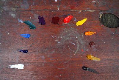
Notice, there's no black on my palette. After I discovered I could mix a deep, rich black from burnt umber and ultramarine blue, a la Anders Zorn, I went cold turkey and removed black and all its variations from my palette. A student once asked me what I had against black. I had to think about that for a minute. I don't like black because it seems so one-dimensional. By that I mean it's a neutral black. By mixing different amounts of ultramarine blue and burnt umber, you can tweek the temperature. More blue will make it cooler, more umber will make it warmer. You can make lighter versions of black (I think it's called gray) by combining cerulean blue or burnt sienna or any variation of blue and brown. I know Sargent had black on his palette. After a steady diet of looking at Munnings' paintings for a few years with his bright colors, I was alarmed to see how much black was in Sargent's flesh tones!
Once my palette is done, I'm ready to go. I use linseed oil as a medium for thinning oil colors, and turpentine to clean my brushes. I also use Liquin as a drier if I need something dried in a hurry. It leaves a shiny gloss to the surface, and some very well known landscape painters tout it as a varnish! It clearly states on the bottle, "Do Not Use As A Varnish." I have no idea what it will do to the layers of paint in various states of drying underneath the top layer of Liquin, so I just heed the label's warning and urge all my reader to do likewise, regardless of what the workshop instructor says! These artists are ignoring the tenets of the manufacturer's recommendations without knowing what will happen to their paintings in 50 or 100 years. To them I say, "Good Luck!"
Okay, so where should I start? I start with the background. Here's where I use Sanden's method of relating the darkest areas of the grass to the middle-value areas, and then the middle-value areas to the light areas. It's a tried and true method and you won't go far wrong if you keep relating the values of one mass to another.
Okay, so where should I start? I start with the background. Here's where I use Sanden's method of relating the darkest areas of the grass to the middle-value areas, and then the middle-value areas to the light areas. It's a tried and true method and you won't go far wrong if you keep relating the values of one mass to another.

As the grass area takes shape, I paint in the trees and shadows behind the main figures as well. This brings the painting together because I'm using the same colors I used for the grass.

I add ultramarine blue and burnt umber for the dark shadows of the tree trunks in the background. To this I'll add some white, manganese violet and yellow ochre for that lovely light & shadow patch in the upper left-hand corner. The tree trunks are a mixture of cadmium red light, ultramarine blue and white. The background now has all the large background masses broadly painted in (below).
 I'm now ready to start the large masses on the hounds. I'll start with the dark areas of the main hound, including the tan or brown markings on his back, ears and face. I'll move on to the white areas that are in shadow after that. Sanden used to say "Paint with the largest brush possible," and that's great advice. It keeps you from getting caught up in painting small details before they're needed.

You can see at this stage (above) that some of the details are beginning to appear, but note the broad areas of white and black in the hound and compare them to the same areas in the finished painting below.


You can see at this stage (above) that some of the details are beginning to appear, but note the broad areas of white and black in the hound and compare them to the same areas in the finished painting below.

The finishing touches, such as the blades of grass, the eyes and dappled sunlight are painted after the paint has dried. These details can be overworked if you're not careful, so add them sparingly. That just might be a great subject for another post: "The Kiss of Death; Overworking a Painting," along with the blog on warm and cool in color mixing. But that's all for now!
Please send any questions you have about my techniques. I'd be happy to answer them.
No comments:
Post a Comment